Essential Art Vocabulary

International Women's Day - Annie's story, art pioneer (subtitled video)

Sunday, 10 February 2019

Week 3: more shape, form, plus a start oChristineV a:n EDGES...

A lovely mix of work today. The good progress we are making this term will set us all up very nicely for our main projects which we will be starting in a couple of week's time. Here is tonight's gallery (comments now added - see below each picture):

Andy: excellent observation of shape with good line quality on the edges. Your best drawing yet! The ink used for the outer edge of each leaf is effective stylistically. On the next one try to use pencil with varied line weights to compare techniques. 

Andy: good design/composition. Like the full use of the whole sheet taking the colours to all the edges. Much stronger. Try to add more information to the edges of the face and hands - look again at photos to get shapes of the hands/fingers. 

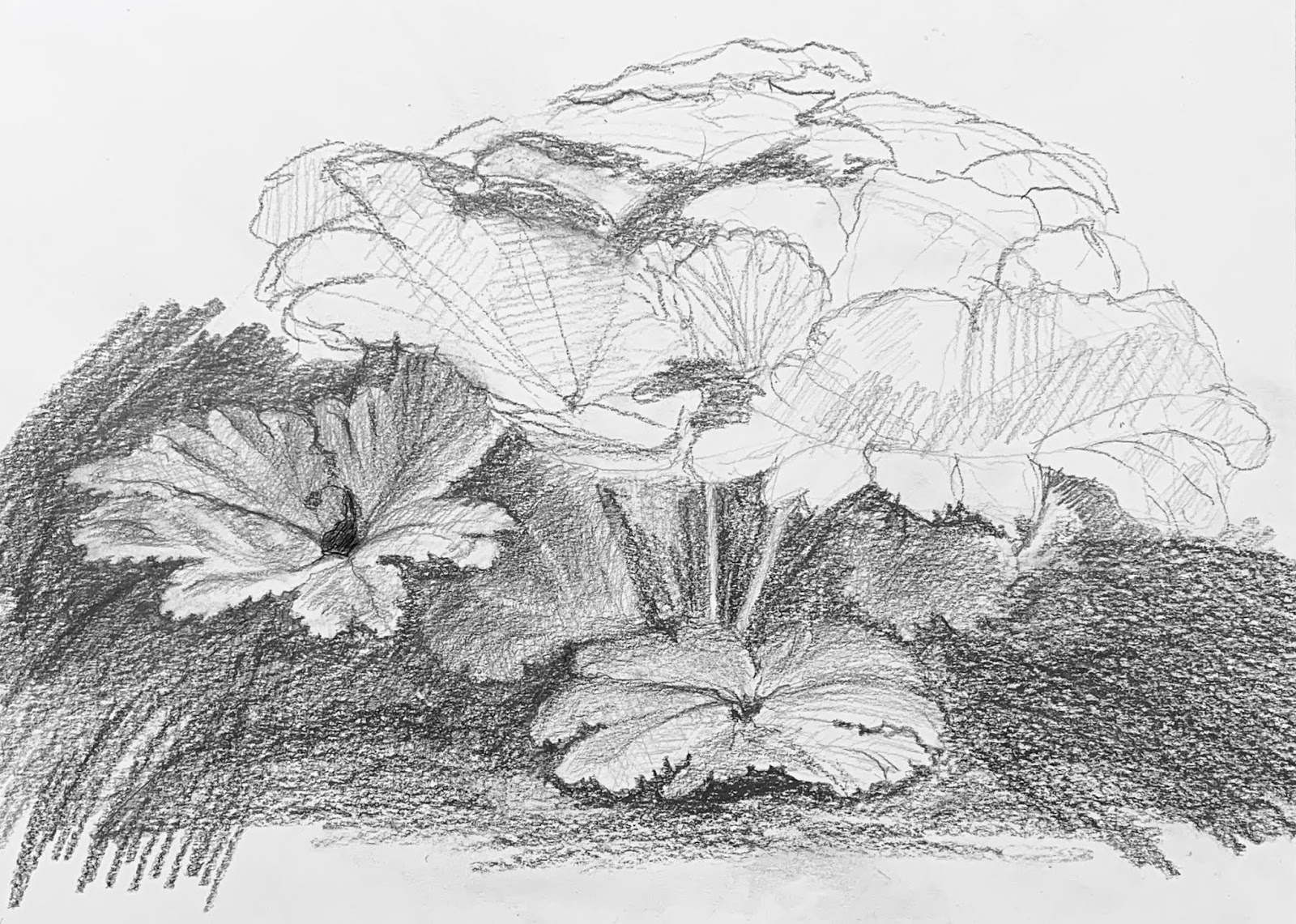
Caroline: lovely bold start. Very good early tonal values on the lower two leaves/background. Complete the background tone next and before you develop the leaves further. This will help you see what the tone values should be as you develop the whole plant.

Dot: a great start. Good bold and clean shapes. Get all the ground colour work done first then develop the blending of the colours in each petal. Paint there background shapes with bold colour and blending to create textures in the background - trust your imagination.

Ella: a beautiful drawing with such good attention to detailing. The edges are wonderfully executed as is the impression of movement on the surface of the feathers. I cannot suggest anything for you to do as this looks finished. Well done! 

Graeme: a lovely drawing. Very good use of imagination and good clean lines to ensure each shape is clear. Try looking again at insects to increase your memory of the unique shapes, edges and textures of these creatures - it would be really beneficial to you to do some further studies from photos on the iPads in class.

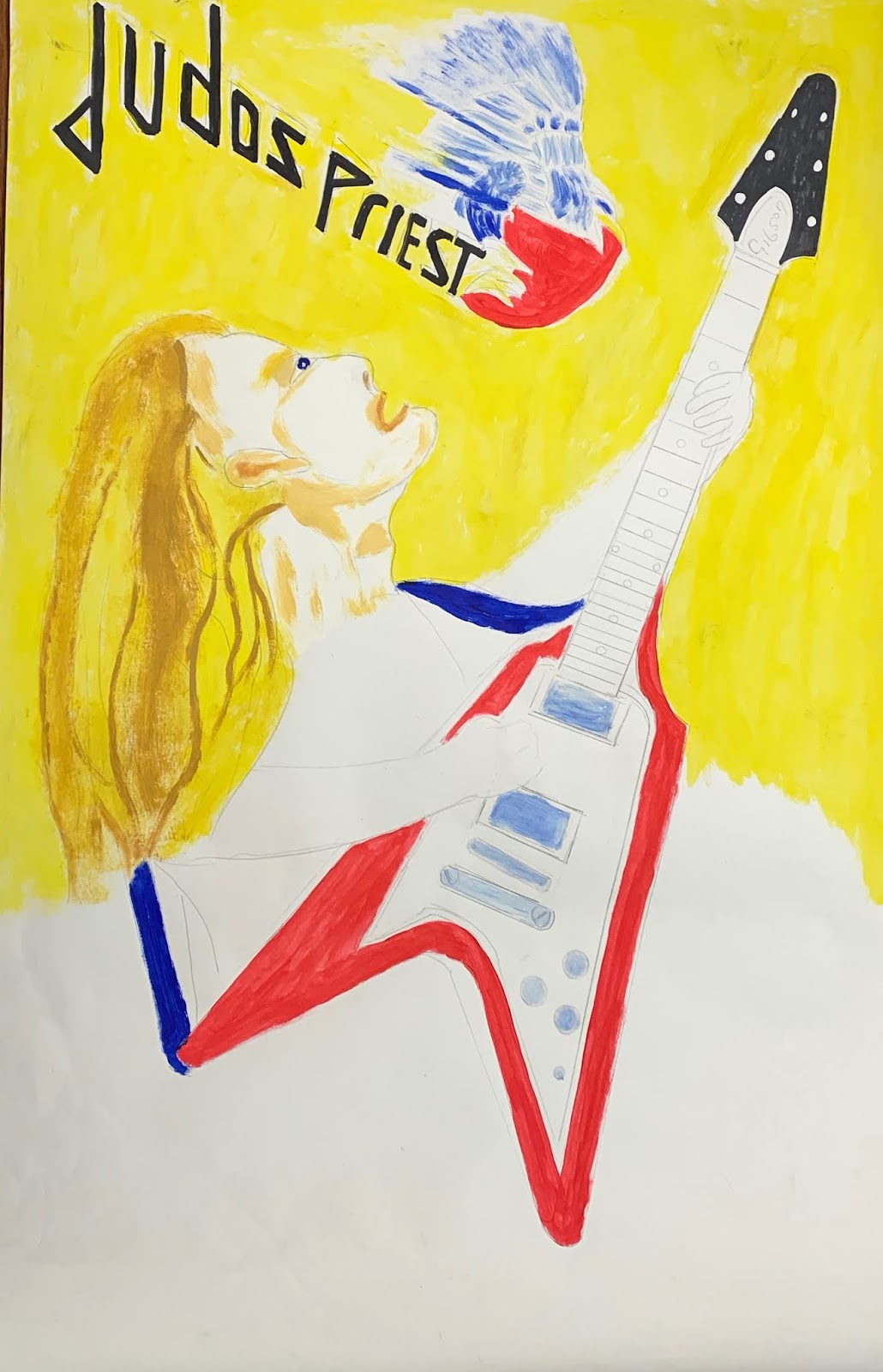
Graeme: good use of the whole sheet. It's early days for this painting but it looks promising!  Look again at hands of guitarists to tighten up the drawing/shapes/angles of the hands/fingers. 

Jed: a good start and though its just at the beginning this looks like it will be a strong painting/colour study/exercise for you. Keep this simple as this will help you to learn how to use the medium as well as give you some good practice in use of colour. Nearly everything you learn using pastels will transfer to acrylics.

Jeff: a great painting. Like the contrast of using greys for factory to contrast with the warm and rich colours in the foreground. The smoke is especially good with soft blending conveying the movement and texture off smoke. 

Rebecca: a great colour! A good start so keep going as it will be worth it. Leave the pink flower as it is for now and add in the rest of the picture. Keep everything simple and bold for now then later, when all the white paper is covered in pastel colours, develop more complex blending of the colours.

Waseem: a lovely intimate study of the leaf. Your edges are really terrific and your tone work is strong.  To finish this off well, use a small rubber, slowly and carefully, to erase the smudging around the leaf edges - this will not only clean the white paper it will help you to sharpen the edges of each leaflet. 

Yvonne: a really well observed study. It is early days but this is going to be such a good drawing if you focus and take your time/carefully use line weight to tease out the subtleties of the plant. Try adding a larger version of this part of the plant in the background so the three stems appear in front or leave it as a simple graceful drawing of three stems. 

Yvonne: great little study. You have really captured the subtle patterns on the leaves. I will show you how to take this a bit further - remind me in class next time!! You must keep up making these small studies in your sketchbook as it is paying you huge dividends. 

Friday, 1 February 2019

Week Two: shape and form / ferns and foliage pt2!

A really great session with everyone showing real progress in this challenging skill/task. Although this project has involved slow, careful observation and tight control of lines your patience and commitment has enabled you to learn bucket loads!  Next week most of us will move to look at form/tone whilst others are keen to get going on their main projects and interests! Should be cracking good term.

Andy: good use of the whole frame/sheet gives this a strong look. Beautiful angles and subtle curves turning the leaves.  Try varying your line weight so there are dark/heavy lines for the nearer leaves and light/thinner lines for the leaves farther away.

Catherine: lovely drawing style, carefully observed, with impressive consistency of line(!) plus great use of the frame - the leaf fills the sheet making it feel strong and bold which is perfect for this plant. You should finish this one as it is a very good drawing.

Claire: you are developing these drawings so well! You have drawn really difficult shapes - ellipses and done it simply brilliantly. Good variation of the line weights. Such good progress!

Dorothy: this is a really strong drawing with a bold feel that suits the plant's character. Good line weights. Try drawing with an eraser to lighten the edges of the two tall leaves at the back off the plant. Then add just a bit more weight/thickness to the leaves in the foreground, This should increase the sense of space even more. 

Dorothy: a good start with precise angles and that soft chunky look to the leaf that monstera ferns are particularly known for and liked. Perhaps, to add interest for you, try repeating the leaf once or twice and in different angles on the sheet with the leaves partially hiding each other. This will give you the freedom to be creative and it will to show overlapping perspective giving the picture even more appeal. 

Ella: what a truly beautiful drawing! You have captured the delicate but sharp edge of the feathers supremely well.  Although the leaf on the right is not finished I like the lightness of its lines as it seems to be in the distance making the picture very interesting and more than a study of feathers. Stunning work.

Graeme: lovely bold, confident lines - you seem to have benefited a lot from last week when you worked hard to study line and shape. Try to maintain this level of concentration and then vary the line weights more to add interest. This will also mean your paintings will have a bolder and more decisive look.

Jed: a great first drawing. I really like the way you are seeing the angular qualities in the feather.  Try using a slightly harder pencil (HB or H) for the finer feathery lines and contrast with the blacker softer pencil lines (2B or 4B). For the delicate look of feathers keep your pencil points sharp and vary the pressure you use on the lines.

Jeff: a really accomplished drawing and a very well observed study in shape using only line - this is very tricky to do and you have done it beautifully! Great use of the whole frame to show off the architectural qualities of the whole plant shape. Remember to use deliberately varied line weights to add sparkle.


Rebecca: this is so good! You have shown such big progress in your observation and technical skills since starting the course last year. I especially admire your delicate and highly clever use of varying line weights within the petals and the way you create the curving leaf edges - magic.

Waseem: this is excellent! You have worked so hard and been so careful with this drawing. You have looked at this plant so carefully (observation skills) that you have been able to create a very accurate picture with the correct proportions and good use of the drawing frame (the box you drew around the image when you started). Well done! 

Yvonne: this was a challenge for you but your persistence has really paid off and has set you up well for the rest of the term. Good observation of shape and very good line weight variation and awareness of overlapping perspective. This is a slow burn technique but the learning that is in this drawing is immense and will help you lots over the term.

Monday, 28 January 2019

Week One: ferns and foliage / shape and form

We started our new term, after a lengthy break, with an exercise to help us recall some key basic skills that we will need for the term: how to see shape, how to use line, finding pattern, developing edges, varying line weights (i.e. hand pressure to draw thin, light/thick, dark lines) and simple, quick, accurate ways to measure check basic proportions. The beautiful plant group of ferns is giving us the inspiration to do this. Here are the first stage drawings from today. Watch the short video, opposite, on the elements of line. This will help to reinforce your understanding of the concept of line and shape.

Andy: well observed big shape of cluster of flowers with very well drawn shapes of each flower, especially your contour lines (the flower edges). Make more use of varied line weights with more contrast between dark and light lines. This will add extra depth to your drawing. Keep your pencil points sharpened to give you full control of line weight and pressure. Use a softer pencil (e.g. 2B - 4B).

Catherine: very nice start with a sensitive and considered study of the angles and curves in the big outer shape. Your drawing of the leaflet shapes in the bottom right is very good. There is good use of line weight variation towards the top end of the main stem. Keep going and use a fine point (sharpened) soft pencil (e.g. 2B - 4B) to keep the individual shapes clearly defined and to give you full control of line weight and pressure. Keep going - this will be good drawing!

Claire: beautifully observed, confident yet sensitively drawn. Great use of line weight variation giving good sense of space and depth around and within the flower. Try to vary the line weight of the outer edge of the flower a bit more - the edge towards the rear of the flower needs to be lighter and thinner to complete the illusion of space. Keep your pencil points sharpened to give you full control of line weight and pressure. Use a softer pencil (e.g. 2B - 4B). 

Dorothy: good observation and proportions. Especially well observed and drawn edges and curved angles giving each leaf its individuality.  Not easy to do this so well done. Sensitive use of a fine point eraser will also be a useful tool to fine tune the heavier edges and increase the variation in tone of those lines. Keep your pencil points sharpened to give you full control of line weight and pressure. Use a softer pencil (e.g. 2B - 4B). Keep going like this and you will create a really good drawing!

Ella: I really like your sensitive touch and very carefully observed shape and proportion. Your approach is nicely analytical and properly considered - be patient with yourself as this approach is powerful but it takes time to complete each element of study.  Use a 2B-4B pencil with a constantly sharpened pencil point to give you maximum control and range of pressure and line weight. Keep going, it will be well worth it in the end!

Graeme: very strong and confident use of line. Good observation and use of curved angles. Try a sharper pointed soft pencil (e.g. 2B-4B) to increase the variation of line weights to bring out the depth of the body of the bee - the arch of its back, where it is nearest the foreground, should be visually nearer than the head and the bottom. Use heavier lines in the centre section of the body and lighter lines at the head and bottom to achieve this. 

Jeff: excellent approach to the subject and the image. The stems give you a clear sense of the big shape that the group of leaves (the blades) creates. Your angles and curves are really well observed and the way you are tackling the individual small leaflets is great. Keep your pencil points sharpened to give you full control of line weight and pressure. Use soft pencils (e.g. 2B - 4B).  Look for those elements that you think are  closer to you and make their lines a bit blacker and heavier whilst keeping the lovely sensitive feel you have already. 

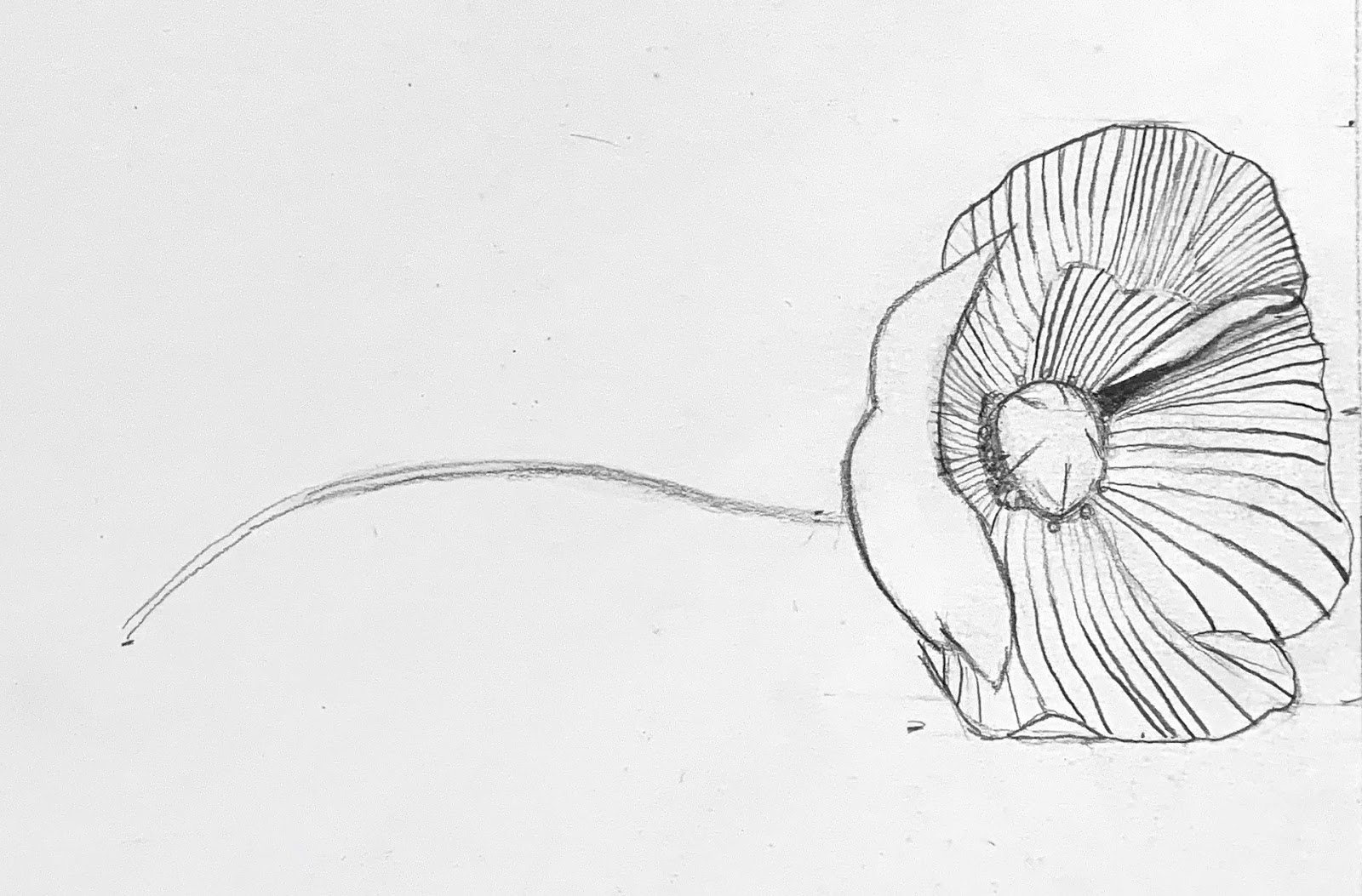
Rebecca: a really lovely and confident drawing. Very well observed shapes and proportions of the flower and excellent observation of the more subtle, soft changes in the flower petal edges. Good attention to detail e.g. where a petal edge turns/curls over. Keep your pencil points sharpened to give you full control of line weight and pressure. Use a softer pencil (e.g. 2B - 4B). 

Waseem: nicely observed details that show how each leaf twists and turns. You have drawn the edges of the leaf shapes with great sensitivity and good control and variation of line weight (good combination of heavy and light lines). Good well balanced proportions of the leaves. Keep your pencil points sharpened to give you full control of line weight and pressure. Use a softer pencil (e.g. 2B - 4B). Keep going - this will be a very good drawing!

Yvonne: very good observation of the big shape of the whole plant with excellent use of simplified, more geometric shape mapping. This is a good example of how drawing a "frame" rectangle before you start the main drawing really helps you to see shape. Good to see a thoughtful approach where you are using the stems to start your understanding of the natural flow of the curved angles of each leaf. The leaflets on the left are nicely and carefully drawn. Keep your pencil points sharpened to give you full control of line weight and pressure. Use a softer pencil (2b - 4B).  Keep going - this is a slow process but you will have a great drawing at the end!