Essential Art Vocabulary

International Women's Day - Annie's story, art pioneer (subtitled video)

Saturday 24 November 2018

Week 9: fabulous observation skills

This is our second from last session of 2018! Everyone is starting to get to grips with proper observation in their drawing, in their understanding of the shapes that make up their subject and in their understanding of colour and tone.

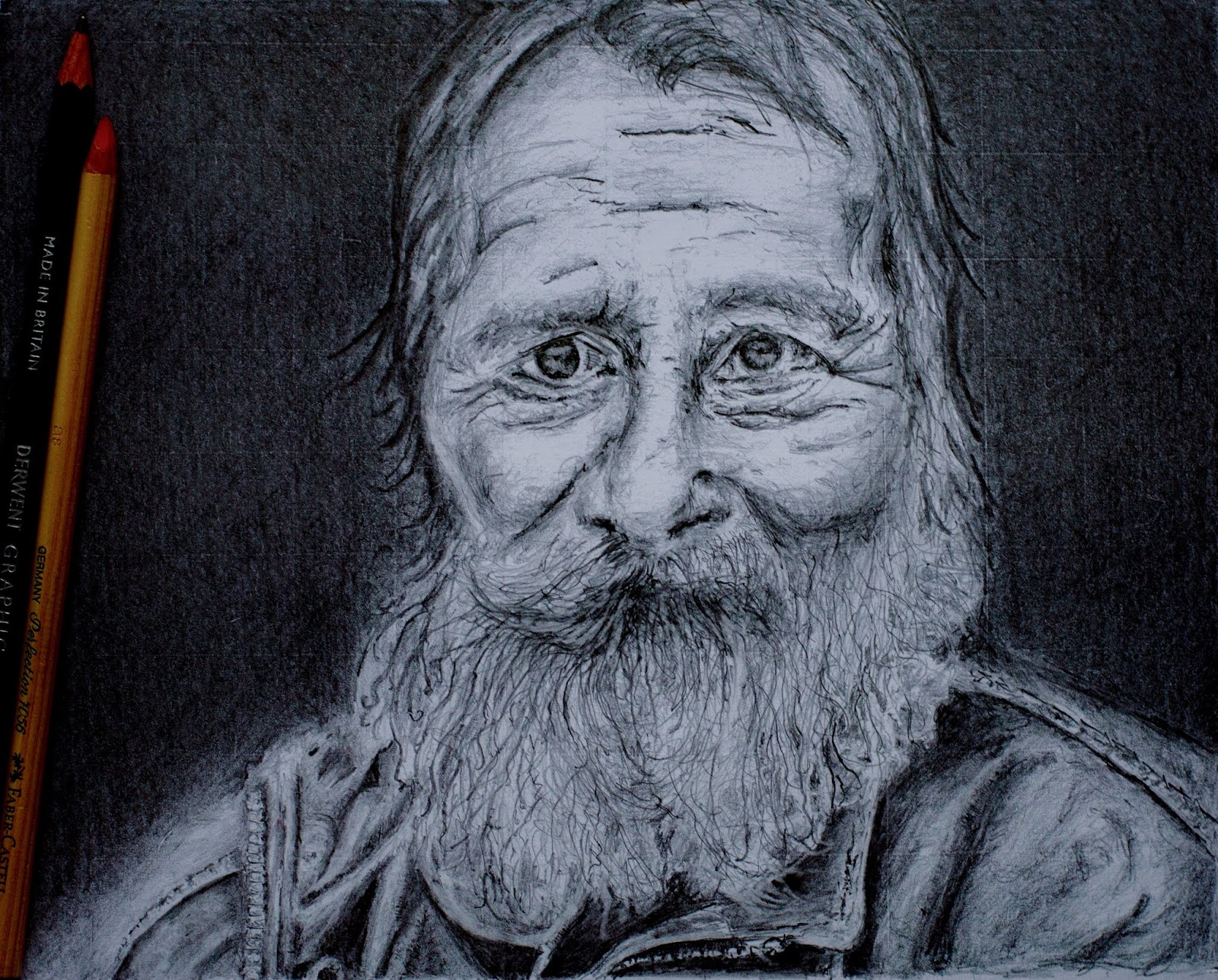
Andy: so good to see you working with better quality original images - it shows in the quality of your drawing.  Keep adding tones to the faces using pencil - try a softer pencil eg 2 or 3B. Then paint the background in several colours.
Claire: superb light in your colours (tints) with skilful contrasting dark colours (tones). Your soft blending is starting to work (right hand sky) so stay focused on that and make all your sky edges, where colours meet, to "blur" together. 
Dot: brilliant control of toned (greyed) colours yet achieving an atmospheric light. Keep gently adding layers of pastel colours to enrich the surface.
Ella: your sensitive and careful approach is working beautifully even at this early stage, This is a slow technique but you be hugely rewarded by the end of the drawing so do not worry about how long it takes and stay focused. Look for at least three basic tones in all the shapes to change the outline flat shape into rounded "forms". Increase the darkness in the darker areas of the drawing to heighten the contrast with the middle and light tones. 
Graeme: excellent painting technique. Now that you are using more paint on the surface your skills are having more room to develop and improve. Think about every shape and try to give them a consistently painted surface so the one shape does not look unfinished compared to the rest.
Jeff: excellent progression of technique and observation, especially your understanding of light and colour temperature. You don't need to make your shadows quite so dark. Look at how the main tower shadow has light in it (well done!) and use that as your compass for shadows in the whole picture.
Rebecca: this is really coming together now! Your trees are very well observed and with excellent light touch to the shapes and colours. The outer edges (contour) of the trees are especially well done. Perhaps for the final stage add more ranges of blue and purple to the sky.
Yvonne: early days but you are now starting to tame the beast!  Your use of studies for the various areas (and challenges) is a vey powerful and effective learning tool and it shows (as can be seen below). In the large picture, continue to work on those areas where you have solved the puzzles in your small studies. 
Yvonne: see comments above. Look carefully at how the colour can change as the stone turn towards the light (right end edge near the door frame.

Saturday 17 November 2018

Week 8: fabulous work

Everyone is working really hard to develop their project paintings and drawings. It is paying off with great progress by everyone.

Yvonne: excellent small scale study with good observation of close, deep tonal relationships. To increase the definition of leaves at the top, add dark blue/brown between the leaves to increase contrast between wall and leaf.
Yvonne: good start to your next study for your main painting. Look for shapes within each stone including the contrast of the earthy tones.
Andy: excellent continuing development of your skills.  Perhaps add a second tone of yellow on the guitar body to suggest reflection of the varnished surface.
Caroline: strong start. Keep shapes fairly simple. It is dark tones and cold versions of colour that make a scene like this work to create that cold, sharp feel.
Dot: such a great start with bold confident shapes and curves. You are on the right track with the overall darkening of the colours, keep doing this. They will look a little flat perhaps because of the dark tones but don't worry, you need to do this to be able to then maximise the colour effect when you add the final brighter colours
Ella: a very good start. Try to be more confident with the style of line you use. It is okay to start with feathered lines like now to feel your way towards accuracy but then decide on the final accurate line within these feathered lines and make them a bold and confident with sufficient hand pressure.
Graeme: your best painting yet. It feels complete and well thought through in terms of the objects which tell the story. Have a look at the way Georgia O'Keefe paints her animal skulls against New Mexico skies for new ideas on how you could paint yours in your next painting.
Jeff: brilliant start with the tones and soft blending on the Angel statue. Look at how rusted metal has a very warm, deep look and see what colours you can see that make this effect and reproduce them in your painting. 
Rebecca: this is so great. You are working really well with dark moody colours and the variety of contrasts you are achieving give it a wonderful sense of drama, two types of drama in fact - in the light areas and in the close dark, more subtly contrasted areas.


Tuesday 13 November 2018

Week 7: fascinating evolutions of projects

Including tonight there are only 4 week's left to end of term and current projects. It is so interesting to follow everyone's projects of work as they continuously evolve and even more new ones emerge.

Ella: Wow! You really have worked on this and it works brilliantly. The tones are nice and deep and they are dark enough to allow the face to glow. You have successfully resolved the hair/beard so well! Good contrast of technique between the hair, face and jacket. I would do a couple more drawings like this to really secure your skills in observation, analysis, tone values and technical ability. Look again at the eyes then try looking at MS Escher and his surreal drawings and see what ideas you have...
Andy: getting better by the week. More variety of technique in the different areas of the painting are creating a much more interesting story in the painting. Think about using the grid "rule of thirds" in your next painting to help you place your various motifs (in this case this would mean the face, the cross, the words, the figure on a horse).
Andy: stronger composition as nearly all areas of the painting are being used. Good to see further detail appearing on your faces. See also comments above about using the grid. 
Caroline: excellent development of the tone values in each area and as a whole. This is really pulling the whole painting together. Love the colour work and depth of pastel powder on the surface.  Continue examining the tone values and looking for even more colours in each shape.
Dot: your best colour work so far! You have now "got it"! The development of the tones, the depth of pastel on the paper and the clever application of the pastel/technique is brilliant. Keep thinking this carefully with this amount of focus and see how things develop further in your next paintings - stay with Felix Vallotton for a while longer for more inspiration.
Dot: see my comments above which apply equally to this delightful study. 
Graeme: your paintings are looking much more complete now you are painting the whole surface. And your increased observation and detail on the face, hands and arms is much more interesting and accurate. Keep looking at the details of the face, arms and hands using better quality photographs and you will continue to increase the quality of your work.
Graeme: early days with this one but see my comments on your other painting above as you consider how to develop this one.
Graeme (apologies if this is Andy's!!!): excellent depth of colour and tone in every part of the surface.  Great to see colours are touching each other rather than the white paper showing as rough gaps in between. See comments above re getting more detail into the portraits.
Jeff: very good placement of the three main objects. When you start painting the colours and tones think about how the three objects can be brought together / made to connect with each other e.g. without unnecessary gaps. Looks like this is going to be another good one.
Jeff: excellent technique with the smoke effect (sfumato) and use of dark blue paper. Leave it like this but review it from time to time to see if new ideas pop up to develop it further - they might not of course!
Yvonne: beautiful tone study. The small scale and square format really seem to help you. The subtle varied background is very good. Keep making these studies, observe well but stay relaxed and confident.  
Yvonne: see my comments on your other study above. Your careful observation and treatment of the petals is very good indeed. By treatment I mean the painting technique, strokes of the pastel stick, dark tone values and just enough use of highlight colours. 

Saturday 3 November 2018

Week 6: moving towards our final projects

Great work tonight with everyone pushing themselves hard and making good progress in their work and increasing their skills.

Andy and Graeme: Black Sabbath Project - great to see the stronger and more confident use of colour in the backgrounds and the figures. We discussed how both of you have intimate knowledge of the working parts of a guitar which really helps you draw from memory in a convincing way and how if you add that same level of knowledge of hands and faces into your memory that the portrait elements will also achieve a better level of convincing. Find the best detailed photos of the musicians you can get hold of and study, study, study. Go for it! 
Caroline: excellent development of the palette, light and very good technique.  Now look again at all the shapes and see if you can add even more depth and character to the colours. For example, look at yellow ochre and orange to blend in to the cornfields.  Look at earthy greens to blend into the grass areas. And so on.
Dorothy: much better design control and pastel work. Don't fuss with details just yet e.g. trees and leaves. Keep your focus on adding more depth of pastel/colour to the basic shapes. If you cannot get more depth then try again on a more textured better quality paper - but remember to first draw in the design (the shapes) in soft pencil outlines and quickly check the measurements before adding the ground colours and the subsequent deeper layers on top. Enjoy working at the problems! This is going to be a great painting soon!
Ella: a striking portrait already. Keep working on the beard as we discussed, blocking in some simple big shapes  with flat tone then overlying eloquent lines of variable weigh on top for the hairs. I suggest you start blocking in the background soon to recreate the atmosphere in the photograph. The dark background will strengthen the face by providing a frame and confident tonal reference. 
Graeme: great to see you taking the painting stages further than previously. Much more interesting to look at. See my comments above on your Sabbath project work to develop this further.
Jeff: fabulous effect and good colour work in the smoke "sfumato" technique area. Start working on the remaining untouched areas of the paper to get further control of the colour developments as you enter the mature stage of this work. 
Rebecca: super colours and very good blending technique. You are learning fast. Keep studying thee colours in the original on the iPad and add more colours to each shape to get that unique pastel look. In the foreground field add the darkest blue you have to the blue lines and the darkest green to the green lines. Then blend in a really dark purple to the blue and see what happens.
Yvonne: this is turning into a beautiful study. To increase the feeling of quietness and closeness of the scene, continue to further darken the background greys well as adding more grey tones to the faces and arms of the adults and the baby's hat. This will create a "pool" of light on the baby's face and the mother's hand. 
Yvonne: lovely colour study showing some good investigative work! Keep making these small studies and you will soon realise how important they can be to your development and confidence.